
Table of Contents
Introduction
Color is more than just a visual element, color combinations is powerful tool that can influence emotions, perceptions, and decisions. The right color combinations in branding can set your brand apart, create emotional connections, and ultimately drive consumer behavior. This article will guide you through the intricacies of using color combinations to enhance your brand’s appeal in 2024.
The Psychology of Color Combinations
Tones can summon a great many feelings and affiliations. For example, red can stimulate feelings of excitement and urgency, while blue often conveys trust and calm. Brands like Facebook leverage these psychological effects to reinforce their brand messages.
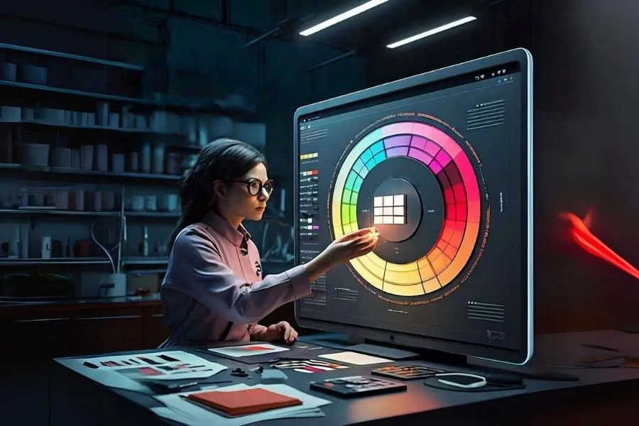
Understanding Color Combinations Theory
Before diving into selecting colors, it’s essential to grasp the basics of color theory. The color wheel is a fundamental tool that shows the relationships between primary (red, blue, yellow), secondary (green, orange, purple), and tertiary colors. Understanding how these colors interact can help you create harmonious and appealing color schemes.
Choosing Your Brand Colors
Your brand colors should align with your brand identity and values. Conduct market research to understand your target audience’s preferences and how they might perceive different colors.
For instance, a brand aimed at children might use bright, playful colors, while a luxury brand might opt for more subdued, elegant hues.
Color Combinations That Work
- Complementary Colors: These are opposite each other on the color wheel, like blue and orange. They create a high-contrast, vibrant look.
- Analogous Colors: These are next to each other on the color wheel, such as blue, blue-green, and green. They produce a more harmonious and serene effect.
- Triadic Colors: These are evenly spaced around the color wheel, like red, yellow, and blue. They offer a reasonable and dynamic look.
Using Color Combinations to Evoke Specific Feelings
- Warm Colors: Reds, oranges, and yellows can evoke energy, passion, and warmth. They are great for brands that want to convey excitement or urgency.
- Cool Colors: Blues, greens, and purples can evoke calmness, trust, and serenity. These are ideal for brands aiming to build trust and reliability.
Industry-Specific Color Choices
- Tech and Innovation Brands: Often use blues and greens to convey trust and innovation. Think of brands like Apple and Google.
- Health and Wellness Brands: Tend to use greens and earthy tones to convey health and nature.
- Luxury and High-End Brands: Opt for blacks, golds, and silvers to convey sophistication and exclusivity.
Creating a Color Palette

There are several tools available to help you develop a color palette, such as Adobe Color and Coolors. Once you have a palette, test it across various mediums to ensure it looks good both digitally and in print.
Adobe Color (https://color.adobe.com/) is a free online tool that lets you explore color schemes based on various rules (complementary, analogous, etc.) or create your own using a color wheel.
Coolors (https://www.instagram.com/coolors.co/?hl=en) is another popular web-based tool for generating color palettes. It allows you to lock specific colors and experiment with different combinations.
Dribbble (https://dribbble.com/) is a social platform for designers where you can find tons of color palette inspiration by browsing design projects.
Implementing Color in Your Branding
- Logo Design: Your logo is the most recognizable element of your brand, so choose colors that represent your brand’s core values.
- Website and Digital Presence: Use your color palette consistently across your website and social media platforms.
- Packaging and Physical Products: Ensure that your product packaging reflects your brand colors to create a cohesive brand experience.
Tips for Maintaining Brand Consistency
Consistency is crucial in branding to build trust and recognition among consumers. Here are some practical tips to ensure your brand colors remain consistent across all touchpoints:
Create Detailed Brand Guidelines
Develop comprehensive brand guidelines that outline the precise use of colors, including primary and secondary palettes, color codes (RGB, CMYK, HEX), and where each color should be used (logo, website, packaging).
Use Color Psychology Wisely
Refer back to color psychology principles when deciding color updates or expansions. Ensure your chosen colors align with your brand values and resonate with your target audience.
Regularly Review and Update Guidelines
As trends evolve and consumer preferences shift, periodically review your brand guidelines to ensure they remain relevant and effective. Update them as needed to maintain a modern and appealing brand image.
Seek Feedback from Stakeholders
Engage key stakeholders, including employees, customers, and marketing professionals, to gather feedback on your brand colors. Their insights can provide valuable perspectives on how colors are perceived and their impact on brand perception.
Monitor and Adapt to Market Changes
Keep an eye on industry trends and competitor strategies regarding color usage. While maintaining consistency is vital, being adaptable to market changes ensures your brand remains relevant and competitive.
Conclusion
The power of color combinations is not just about aesthetics but also about strategic brand communication. By understanding color psychology, leveraging industry trends, and maintaining brand consistency, businesses can effectively enhance their brand’s appeal and connect with their target audience on a deeper level. So, whether you’re refreshing your brand’s image or starting anew, remember that colors speak volumes—make sure they’re saying the right things about your brand.
FAQs
1. How would I pick the right tones for my image?
Start by considering your brand’s personality, target audience, and industry norms. Conduct research on color psychology to understand the emotions different colors evoke.
2. Can I use multiple color palettes for different products under the same brand?
Yes, you can use variations of your primary brand palette for different product lines or campaigns. Ensure there’s a cohesive element tying them back to your main brand identity.
3. Should I follow color trends or stick with timeless colors for my brand?
It depends on your brand’s positioning and target market. Incorporating trendy colors can attract attention, but ensure they align with your brand values to maintain authenticity.
4. How often should I update my brand colors?
Avoid frequent changes unless necessary for rebranding or strategic reasons. Aim for consistency over time while periodically reviewing for relevance.
5. What if my brand colors clash with cultural meanings in international markets?
Research cultural color symbolism in your target markets to avoid unintended associations. Adapt your color palette if necessary to respect cultural sensitivities.